

Unleash Your Creativity with Every Stroke! ✍️
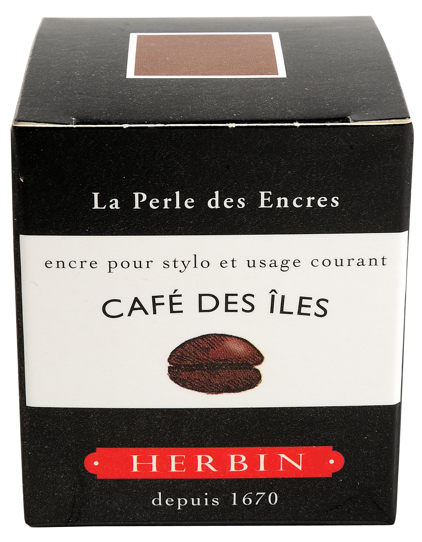
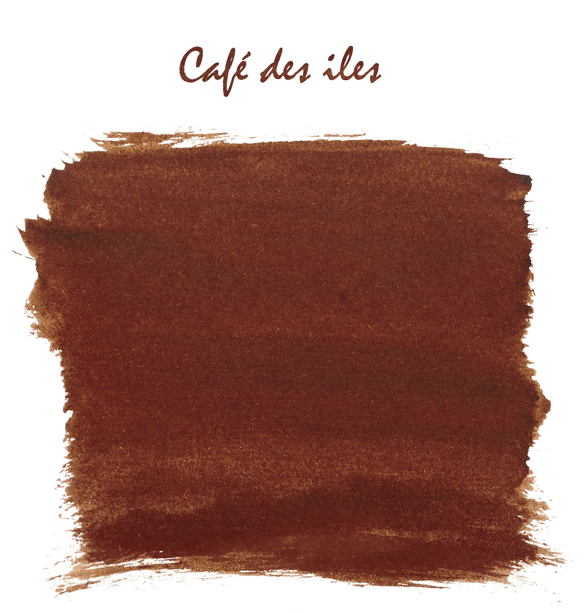
J. Herbin Fountain Pen Ink - Café des Iles is a 30 ml bottled ink that combines non-toxic, pH neutral, and water-based properties, ensuring a smooth, fast-drying writing experience with all-natural dyes.
J**A
Vibrant and beautiful albeit not too purple, on writing paper it looks amazing on cheap paper it looks good but not perfect
While I love getting new ink I was looking forward to this one for a while, as soon as i loaded it into a pen and started writing with it i noticed that it is very smooth and doesnt feather or bleed through the pages unless you are using a very common paper like a copy paper or plain ruled note taking paper. With these lesser papers it does not stay as tight as a heavy bonded sheet and can look a little less clean.I know most people who will use this ink will use a thick writing paper under their pen but for the common person I was hoping for it to be able to transition from fancy paper to pauper paper with no noticeable change it lettering size or quality. This was not the case which is the only reason I did not give it 5 stars, in my school environment i need ink that can go from page to page and look the same like my Waterman or Mont Blanc inks which i tested side by side and noticed less "bleed" around the letters.All in all a very fine ink, looks majestic on a stark sheet of paper, although I think I would have preferred a little more violet in the ink, it has almost a plum color look to it on the page but that is a personal preference, and in the long run I am sure I am better off with this; than a middle school gel pen colored purple that jumps off the page instead of eases off like this one does.
S**N
Purple Power!
This is my everyday ink. It's in all of my fountain pens aside from one which has Noodler's Black. It's a very dark purple to the point where it almost looks black from afar but once you look at it closely, you can see that it's purple. I love that. It's very subtle. It's not showing off at all. If you're that type of person that likes subtle things that doesn't try to grab attention, this is for you. Of course, it helps if you actually like purple and violet so. It just so happens that purple/violet is my favorite color. If you're the type that wants to be noticed all the time, this ink is not gonna sit well with you.
R**X
More purple than expected, but it grew on me.
It took a few days of using this ink to start to appreciate it. At first, all I saw was purple and I was ready to write a bad review, but over time, it grew on me. I got into fountain pens and inks for signature purposes only. So I am mainly looking for an ink that will stand out from the rest. So when I first saw this on paper as "purple" I knew it was not for me. In the construction world, the male of the species is shunned for using purple ink. After many tests on paper, I used it for some work documents and I can't explain why, but it seemed less purple...enough for me to deem it acceptable.Depending on the review, it is either purple or blue. If the thought of purple ink scares you...then I would not recommend it. If you like the idea of hints of purple to maybe all purple, then give it a try. Or not. I am not here to tell you how to live your life.
M**E
A wonderfully vibrant blue ink, and I love blue inks.
I'm a big fan of blue inks; Noodler's BayState Blue is probably my favorite color, but it doesn't offer much shading, and I always have concerns about staining my pens. In my search for similar hues with better secondary properties, I've tried dozens of inks, and I'd rank Eclat De Saphir right up there in my top 3 runners up (along with Diamine Sapphire Blue and Pilot's iroshizuku Asa-gao).The Herbin color is slightly less saturated then the others that I mention (though just slightly), but that gives it a little more room for shading. Otherwise, the blue is bright and vibrant, but dark enough to be taken seriously. Flow is excellent and smooth, on the wet side. I love it.
M**D
Poussiere de Lune = plum
I tested this ink with three pens:Regular dip pen with a Zebra Comic G tip (top portion)Pros:-Shows the true color-smooth ink flowCons:-Very bad feathering on copy paper due to inconsistent ink flow, which also causes bleeding-very think ink for a dip pen. The last line a tried a one dip test, which basically I dipped my pen one time and wrote until I ran out of ink. It lasted one full seven word sentence and three on the second sentence. Fine a thicker ink for dip pens.Cheap size 2 dip pen nib (word Hello)I'm not a fan of writing with a calligraphy tip at all, but the issues were the same with this nib as it was with the zebra nib. The ink pretty much was all used on the first letter of the sentence :( Now I have used these nibs with a ink cartridge before and they do write fairly well, but not with this ink.The third pen is the last three lines. (Cheap fountain pen using an ink converter)This nib is a extra fine nib from China in an EF.This ink appeared much lighter because the ink flow is more consistent with fountain pens. It is more of a mauve color than a plum color. I'm okay with the saturation of color due to fountain pens, but rule of thumb is always go for a darker ink if you want a vibrant color.Also a tip for beginners: This is a watery consistency. It is great for fountain pens (ones that use cartridges or converters) not so great for dip pens. Try to get a thicker ink such as India inks.
M**R
Beautiful ink color
Beautiful ink color. Much more pinkish-gray than the picture shows, but still a lovely pink-purple color and good quality ink. Makes a good ink wash as well for any artists.
C**D
Delicious color
I'll repeat what I said for my review of J. Herbin's Ambre de Birmanie. It's as if certain scents, tastes, colors don't exist .. are impossible, are outside the realm of the senses, the palate, or the spectrum .. until you encounter them. Suddenly you remember that life is filled with little miracles .. Moon Dust, Poussiere de Lune, is one such reminder. Who would have imagined that such a color could exists? Beautiful!!
T**A
Disappointed
The color of this ink is nice. When wet, it is purplish but dries to be a nice light blue shade. Sapphire brilliance suggested by its name is not there though, the color does not remind of a sapphire and does not have a sheen, rather it is a mellow light blue hydrangea color. The biggest issue I have with it is its dryness and lack of saturation. Dryness means that it flows less readily and as it is not rich in saturation it results in a pale and labored writing. I tried it on Tomoe River and Rhodia paper and my writing wasn’t fluid or effortless in either case and that’s such a disappointment. Personally, I’ll keep it with Iroshizuku, Dryden and Waterman.
M**E
Encre pour stylo-plume J. Herbin - Lie de thé
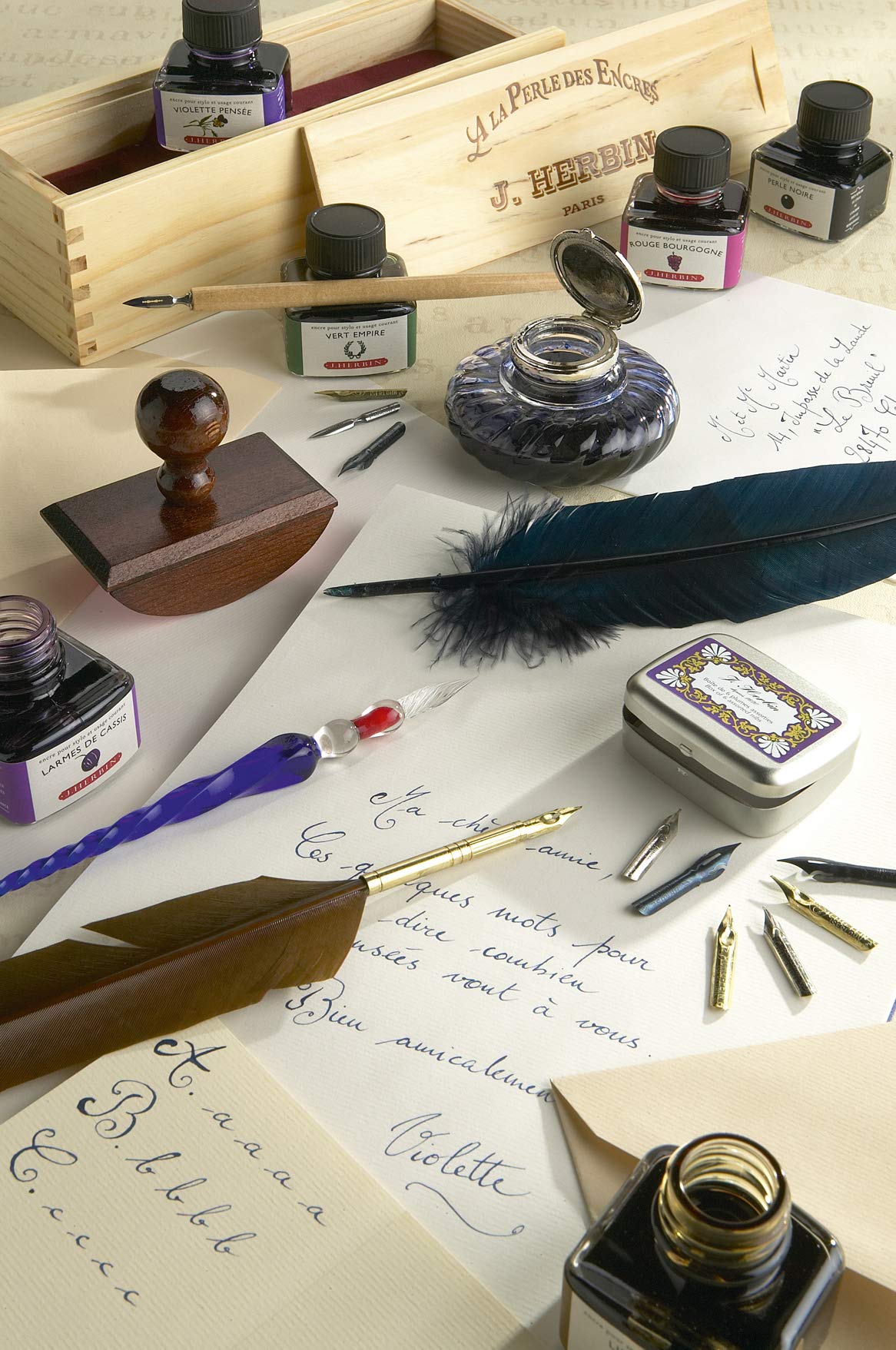
Le flacon est livré dans un carton d'emballage fin mais bien orné, revêtu d'une fine pellicule imperméabilisée. On le découvre (5 cm de côté sur une même hauteur) dans un verre épais et transparent (vue permanente sur le niveau d' encre). Le goulot n' est pas trop étroit (environ 2 cm de diamètre intérieur) et permet d'y plonger la plume afin de remplir le convertisseur d' encre. Un côté présente une forme discrètement incurvée pour y délaisser le stylo. L 'encrier ne s' avère pas parfait à l' utilisation, surtout en fin d' approvisionnement. Mais il est déjà très stable, un point non négligeable.- - -Spécificités des encres J. Herbin :- Compositions d'origine naturelle.- Transparence pour la majorité des coloris. Excepté pour "Perle noire".- Finesse, très bonne fluidité.- Douceur de glisse, lubrification de la plume.- Séchage assez rapide. Les impatients (et) gauchers apprécieront.- Bonne tenue à la lumière et dans le temps.- Résistance moyenne à l'eau."Lie de thé" est un marron sépia moyen. Il demeure bien lisible tracé, réceptif aux ombrages. Son intensité fluctue et trouve, au plus clair de ses formes une belle luminosité. Je lui trouve comme un triple équilibre "intensité-éclat-transparence" particulièrement bien réussi. Les écritures sont bercées jusqu'aux limites de chaque équilibre, vivantes sans ostentation, avec une personnalité subtile, agréable à découvrir.A l'instar du "Lierre sauvage", de la "Terre de feu", "Lie de thé" est aux couleurs d' éléments naturels. J. Herbin y est assez fidèle à travers son nuancier."Lie de thé" représente à mes yeux une belle encre de contrastes : chauds, lumineux, intenses, profonds, discrets' Dormant dans un joli flacon aux airs d' antan, l' ensemble n' en est plus que charmant.Les couleurs sont délicates. La plume les choisit en fonction de ses interlocuteurs et au gré de ses inspirations. Elle se pare d'une robe en chaque occasion.- - -Ci-dessous, un aperçu de quelques encres J. Herbin. Attention : il est effectué avec une plume calligraphique (au porte-plume) de 1 mm et non un stylo-plume fin. Les tonalités, effets' varient considérablement en fonction de la façon d'écrire de tout un chacun, la perception (réglage de l'écran itou), des stylos-plumes, de la qualité du papier utilisée, etc'
A**E
beautiful dense black ink
I love this ink. It flows very well from my sheaffer prelude pen. It is not water proof. But it is a lovely dense black. A delight to use pen and ink.
M**N
Stunning colour
Such a beautiful coloured ink; a gorgeous bright violet that's not too pink yet not too blue.
A**S
As good as it was rumoured to be!
Fantastic ink. Glorious shading, deep hue, an absolute pleasure to use. Straight into my top five!
H**R
Schreibt gut
Ich verschreibe die Tinte J. Herbin Poussière De Lune mit einem Lamy 2000 (B) und einem Diplomat Aero (M). Zwar war ich angesichts des poetischen Namens (Mondstaub) und angesichts einiger begeisterter Rezensionen von einem geheimnisvolleren Farbton ausgegangen, und nicht von dem dunklen ruhigen Violett mit einem Tropfen Oxblood, das ich nun auf dem Papier sehe. Technisch aber ist die Tinte wirklich gut: Sie fließt gut in die Feder, schreibt sich angenehm leicht, zerläuft nicht auch auf einfachem Papier, und sättigt gut. Kurzum: Alltagstauglich.Das Tintenglas (30 ml) jedoch ist nicht so geschickt gemacht; es dürfte nur mit einer Spritze ganz zu leeren sein.
Trustpilot
3 weeks ago
1 month ago