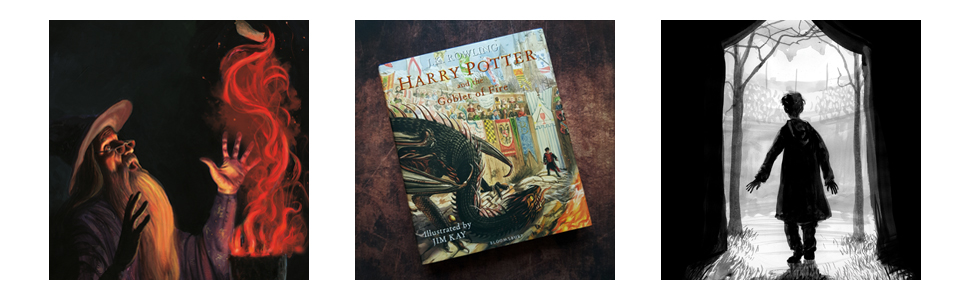
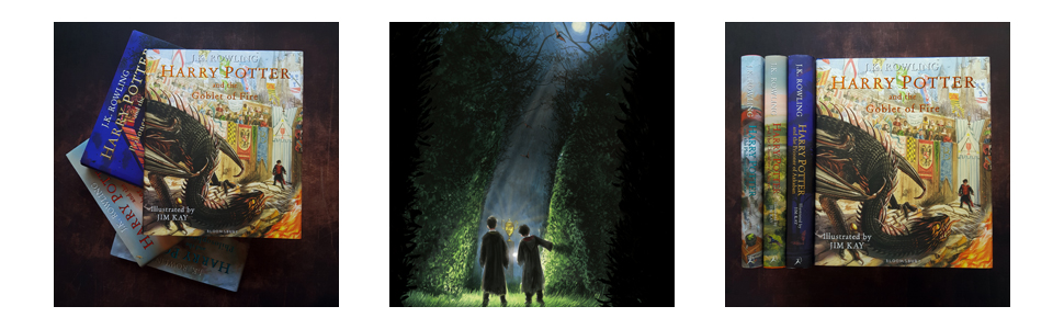
Harry Potter and the Goblet of Fire: Illustrated Edition
S**I
must have if you are a potterhead.
GOOD - you can buy a 100 of editions of HP in the market but this the best harry potter edition so far, JIM KAY drawn the words of Rowling with true magic. the mood, theme are well executed with proper usage of colors and sketches. highly excited for the 5, 6 and 7th book to come out.BAD - my book came out with little scratches on the cover (dont know if the problem is with this seller)
A**R
Not the same
I've bought every single one of these books so far and I've loved them but this one just does not live up to the others. I thought there was an extra year for this to be produced so there could be more illustrations but there is not. So many opportunities missed (only one illustration of the yule ball???). The chapter pages are not as pretty as before, with a border effect this time, and the background pages used to be very personalised to the chapters but are not anymore. All of the illustrations that are there are stunning and I appreciate it's hard work but this book had an extra year over the others and yet it is the most disappointing so far. I was very excited for this one and I still love it but it does not have the heart the others have.
A**A
First impression of the Jim Kay Illustrated Goblet of Fire
I have pre-ordered this book and after a long wait received it. After third volume, it is after 2 years the much awaited fourth part illustrated by Jim Kay is released. Here is a quick review of this edition.1. This is mammoth book. Part 1, 2,3 had 256, 272, 336 pages respectively. This is much larger with 464 pages.2. Length and breadth is same as first three volumes.3. Thickness of the book is almost same as third though the number of pages has increased almost by 38% in fourth volume. The thickness of the pages is slightly reduced than the earlier volumes. Font size is also small as compared to previous volumes. I guess this decision was taken considering very high number of pages. With the same thickness and font size, this book have become very bulky. (May be in future it can be divided in two parts ?)4. Pages are glossy as usual.5. Earlier volumes had either small illustrations or decoration or different background colors or background image on each and every page. This luxury is not observed in this volume. Many pages are usual printed pages.6. Title page of each chapter is simple with decorative boarder and some symbolic images on top. In earlier volumes, each chapter began with illustrations or differently background colors.5. Needless to say, stunning illustrations by Jim Kay which makes it worth with all minor shortcomings.Potterheads ....go and grab it. You wont be disappointed.
R**Y
Just when I think he's improving.....
I've always had a problem with Jim Kay's illustrations. I have found them to nursery bookish for the average Harry Potter reader. I really didn't take to the first book in the series because of it's fantastical quality that was more in keeping with a preschool book than a young teens to adult novel.With book two the style matured a bit as if he accepted that the reading age was also maturing with Harry's progress through his school years and, quite a lot of the whimsical, fantastical and childishness of the first volume was played down and almost disappeared in the second of the series.But sadly the maturity wasn't carried forwards into the third volume and appeared to stall.This one however is somewhat of a mishmash. In some ways it as matured but in other it's taken a retrograde step back into the absurd.Take for instance his depiction of the Hogwarts Express. In the first volume he depicts it like something as dreamt up by Heath Robinson or Emit; a fantastical creation part machine part iron dragon with allsorts of gothic ornamentation.In this volume he depicted it more like the version in the movies. It actually resembles a Great Western steam locomotive but he had to spoil it by giving it a stupidly impossibly high funnel and a dragons crest.Also he doesn't give it a tender. Okay it's a magical train, it runs on magic, but it's got to fool the muggles so it would have a tender for appearance sake. It either looks and behaves like a regular train or it's totally magical; not some hybrid that's neither one or the other. That's only one example there are many others.But the thing that got me the most with this volume is the inconsistency of the depiction of the characters.He doesn't seem to agree with himself as to what any one character looks like from one picture to the next.Harry's apparent age goes up and down throughout the book.At the beginning he looks like a first year, then a couple of chapters in he looks like sixth former then in the next chapter he's a young boy again. The shape of his face changes from picture to picture; you can't have mistaken someone else for him because of the give away glasses and lightning-blot scar.Other characters suffer the same transfiguration from page to page.Also the style of depiction of the characters is more in the style of Quentin Blake, the illustrator for Roald Dahl books, and for me to comic and grotesque for the world of Potter. Yes Potters world is magical, and some may say far fetched, but it is firmly rooted in our reality. The people within it share the same feelings, problems and mundain irritations as the rest of us. That's why we identify with it so much. It's not some comic strip joke of a universe like Roald Dahl writes about (good though that is). No Potter's world is recognisably our world and therefore the characters in it look as we do.While on the characters; none of the illustrations have captions so it's not immediately apparent who it is you are supposed to be looking at; confused by your own imagining of the character, the movie version of the character and that his illustration looks nothing like either.But having said that he is starting to get some other things right. Strangely most of that is the dark side of the story. Voldermort and the Death Eaters, the Darth Mark and I particularly like his Dragons.Maybe he'll get it together by the time he illustrates the Deathly Hallows.Negative criticism aside, which are my own personal feeling on the content; you may totally disagree with them, but as a book it is a beautiful produced volume, quality through out and a nice edition to the range.
K**S
Stunning artwork again
Arrived today and it’s as awesome as the first three. Cant wait for order of the Phoenix next :)
A**E
Too Expensive
Excellent book highly recommended, but NOT from Amazon! Only £15.99 from Sainsbury's Could have saved more than £10 on the 2 I bought.
ترست بايلوت
منذ شهرين
منذ أسبوع